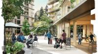
Hovering Kan-Too – Great Bay Area Center Showroom
Project Information
Project Name: Hovering Kan-Too – Great Bay Area Center Showroom
Address: Ma'an Island, Zhongshan, Guangdong, China
Client: Zhongshan Shen Ye Wan Sheng Investment Co., Ltd.
Area: 1800 square meters
Material: Steel, Aluminum Panel, Concrete, PTFE, Perforated Aluminum Panel, Terrazzo
Design Phase: Nov 2021 – May 2022
Cconstruction Phase: March 2022 – July 2022
Design Firm: Wutopia Lab, ArchUnits
Principal Architect: YU Ting
Project Manager: DAI Xinyang
Project Architect: ZHANG Shuojiong
Design Team: GUO Peijian, SHI Jieyu, NI Chenhao
Architecture Construction Drawing Design: CAPOL
Design Team: ZHANG Wei, ZHAO Weiguo, LIU Jin (Water supply & drainage), LI Na (HVAC), LIANG Wenfeng (Electrical)
Facade Design Development: Dadi Façade
Design Team: WANG Zhongli, LI Jinlong, WANG Shuai
Interior Construction Drawing Design: G.ART
Design Team: LI Wei, YUAN Junlong, XUE chao, GAO Dongwei, TAN Jiabin, ZHANG Hongru, WANG Rui, ZHANG Gongbo, HE Qing, WANG Shouheng, ZHOU Fengfu
Decoration Design: G.ART
Design Team: LIANG Qian, ZHENG Yawen, HUA Ke, CHEN Yiwen, CHENG Rangrang
Lighting Consultant: ZHANG Chenlu, WEI Shiyu, LIU Xueyi
Client Architect: MA Pingcheng, YAO Zhu, LIN Haitao
Photographer: CreatAR Images
Hovering Kan-Too
Mountains are only contingencies of geology. They do not kill deliberately, nor do they deliberately please: any emotional properties which they possess are vested in them by human imaginations.
— Mountains of the Mind by Robert Macfarlane
The translucent Great Bay Area Showroom known as the "Hovering Kan-Too" designed by Wutopia Lab, the door to future of Vanke-Shum Yip, was completed and opened in July 2022. Located at the west bank of the Pearl River Delta, and the west gate of the Shenzhen-Zhongshan Bridge, it is in the front-line coastal area of the Great Bay Area. Standing on the roof on sunny days, one can have a view of the spectacular building cluster on the other side of the sea in Qianhai, Shenzhen. The ambitious showroom is a new landmark of the new city floating on the sea.
Persistence of the real estate developer
The showroom assuming the role of building selling represents the only persistence on architecture held by real estate developers having pursuits in an increasingly competitive market. The past few decades have witnessed a booming and highly competitive real estate market, which made Chinese people's residences increasingly homogeneous from plan to façade. However, the showroom, which represents the image of the company and can also enhances the customer experience, is gaining more and more attention. As for the function, the showroom assumes the only role of selling buildings at the beginning, but nowadays, it has multiple functions, that is, to showcase the lifestyle while selling buildings in the early stage, and to transform into a community center or commercial center available for residents later.
For quite a long time, showrooms serving as sales exhibition center were gradually similar in design. With social media booming and becoming an important visual communication tool, real estate developers realized that showrooms can be an important visual medium to drive the impact and sales of their properties. This requires an innovative and unique design for the showroom.
A BDO
Information about the original site of the new town has been wiped off due to the Seven Accesses and One Leveling project. And in fact, after stripping away architecturally limited variants, the sophisticated and fluid overall designs of the demonstration area, are slightly similar in new towns in China. This is Generic City.
I suddenly had a radical idea. I want to make a black BDO reflecting the surroundings: Big Dumb Object. It symbolizes the great power of the unknown, and the mysterious. What it presents is a simple, pure and distinct image, rather than maximalism or human-made tricks. It is a huge, silent and cool object that attracts the attention of all directions of the site, being a hot topic over the network. Without words, people know it just at a glance, that it is the starting point to visit the new town and the ambition to say No to Generic City.
BDO is an identity
The reason I chosed BDO is to inspire the spirit of adventure of my clients. Most new towns are just add-ons developed as a result of the spill over of functions from the central city. I observed that Vanke's ambition for this project was to create a new town with the functions of a central city. But it is beyond the description of any visionary word, and only a concept of impact can represent courage, which is we ordinary people lack. BDO is about courage.
Rejected on the grounds of localization
The project design was sent to the authorities and was rejected on the grounds that it lacked local cultural characteristics. I am reluctant to put a veneer of so-called traditional architecture or a patchy veneer rewriting a traditional architecture in an awkward way on a functional volume under the demands of modern society, or combine common materials of traditional architecture, such as rammed earth bricks and wood on a current building in the name of locality. Nor do I want to thumb through all local literature to add images of specific local characteristics such as the objects, plants and animals to the architecture directly or repeatedly rewrite it into an architecture featuring local characteristics in an awkward way.
I made a bold decision and come back out with a new proposal. I went back to the most familiar terminology, symbolism. I didn't abandon BDO, but once again I used mountain, which I was most familiar with, to give an appearance change to BDO's look which is easy to express and be accepted.
Leveraging the mountain,BDO but whisper
I chose the mountain because "any emotional properties which they possess are vested in them by human imaginations." More importantly, as the most important symbol in traditional Chinese culture, it can also be easily abstracted into various forms of contemporary architectural forms. In addition, since the project is located in Zhongshan, it is a logical reason to take the mountain as a symbol of the local culture.
The black silence of the original BDO without interpretable information is uncomfortable. I used the floating translucent white color, which was familiar to me, in rewriting BDO to give it whisper making people relaxed.
Several principles of creating BDO
First, BDO should be large.
Principle 01: the form should be clear and simple. The form of the showroom is based on a diamond-shaped site. The geometric column is generated and then becomes a simple, pure and distinct image after a few simple cuts that simulate the changing contour lines of a mountain range.
Principle 02: large in volume. A two-and-a-half-story building is designed to 21 meters high, which is the upper limit of low-rising buildings.
Principle 03: large in span. The showroom is giant in structure. A column-free open free space of 16m*30m is supported by the main structure with two sets of core walls integrating evacuation stairs, elevators, tube shafts, toilets and other auxiliary functional spaces. The released public areas of the building continue and extend outdoor views while also flexibly adapting to the exhibition space where the use is unclear.
My Mind on Locality
I had some non-formalistic thoughts about traditional Chinese architecture in the process of writing a special history of ancient Chinese architecture. I have consciously applied these reflections to construct new forms in my architectural creations, which I call "dodges".
Dodges 01: translucent. By referring to ancient historical notes and ancient paintings, it can be presumed that the ancients not only used silk, paper or even mica and glaze as the materials for window lighting and shade, but also covered the body with green yarn to prevent mosquitoes and facilitate ventilation in summer. In daily life, we also used curtains made of cloth, bamboo and bead to shade the sun. This creates a visually ambiguous interface in the building. For this project, I used PTFE with different porosity of 28% and 50% to achieve a translucent effect. It weakens the oppressiveness of BDO and gives a sense of affinity.
Dodges 02: stripping the climatic boundary from the visual boundary. The façade of traditional Chinese architecture changes according to seasons and use requirements. The image we see in the historical heritage doesn’t necessarily mean the visual boundary or the climatic boundary in actual use. The climatic boundary of traditional Chinese architecture is changing. That's why I'm fascinated by the idea of stripping the visual boundary from the climatic one in architectural design.
The reason for choosing PTFE over ETFE this time is that PTFE provides the porosity required to meet the fire-fighting ventilation requirements, which allows architects to create an ambiguous climate cavity between the real building boundary and the membrane. Neither a part of outdoor or indoor environment, this cavity is a "gray space" filled with soft light, lush greenery and breeze, a contemporary expression of the local climate of the LingNan area, located south of the Tropic of Cancer.
Dodges 03: houses within the house. Since traditional buildings are not well insulated, it requires the use of furniture, fabrics and heating items to build smaller, insulated separate spaces inside the house in winter, creating a house within a house.
So I made the space behind the PTFE on the second floor into a village. The meeting rooms, reception rooms and exhibition halls are designed as freestanding houses with pitched roof, arranged around the atrium in an uneven and natural way (Note: The exhibition design does follow the architectural design guidelines, and half of the space on the second floor is temporarily changed during the exhibition construction, which is beyond the design intention). Each cabin has its own climatic boundary and is wrapped in a semi-outdoor green garden, making it a "retreat away from the world".
Dodges 04: floating. When observing the roofs of traditional Chinese buildings, most people limit themselves to the form, color, material, and decoration of the roof. My perception is that the columns of the building seem to pull the heavy and huge roof from flying, rather than support the roof. "As if it were flying". What the Chinese rooftop presents is a kind of ambition to fly.
So in this BDO, I chose a kind of floating to fly, rather than the floating in science fiction movies. First, through the structural-based overhang and the sense of openness of the public space on the first floor, a minimized contact with the ground of the first floor was achieved. The completed building above the second floor is then wrapped with PTFE. The PTFE film, approximately 3 meters in width, continues from the top to the bottom without horizontal seams or horizontal mullions, and hidden frames are adopted for vertical mullions, thus achieving maximum integrity of the white massing.
Dodges 05: the "Ao Shan". The translucent PTFE film reminds me of the ancient lamp mountain called "Ao Shan" made of fabric and paper. Daylight is used to create shadows on the inside of the translucent during the day, and light is used to create shadows on the outside of the translucent at night. These techniques make BDO float and give it a sense of expression.
Kan-too
I hesitated for a long time over the second scheme of the white floating building. For architects, white is the safest color. But it seems less courageous. Suddenly, the snow-covered Khan Tengri deep in the Mountain Tian Shan came into my mind. The marble rock body, which glows red in the late afternoon sunlight, has earned the nickname "Kan-too" and is also known as the most beautiful mountain in the world.
I decided to paint the roof a dazzling orange color, while the first floor was also painted the same orange except the ground, The dark brown ground and the outdoor ground are connected to one another. The red mountain seems to be coming off the ground and flying. The mountain, covered with the translucent white PTFE, also shines in the late afternoon sunlight. Viewing from the street, the white shape goes ups and downs. However, as the viewing angle moves, the orange-red color occasionally emerges from the gaps between the peaks, which is really fascinating. Therefore, the "Hovering Kan-Too" on the west bank of the Pearl River arguably comes into the spotlight.
Journey into Amazing Caves
The first floor of the building needs to meet the needs of publicness and transparency, and it can be seen as a mountain hollowed out continuously, so that a continuous arch is formed in the interior. The orange-red curved perforated aluminum panels continue from the façade through the interior to the core boundary. This allows space of the first floor to gain full outward orientation, forming a whole with the exterior, but separated by a thin climatic boundary of a fully glazed curtain wall.
The orange-red perforated aluminum panels have different aperture sizes and the aperture ratio is capable of meeting the MEP requirements of air conditioning and smoke extraction, thereby creating a clean and continuous wall-ceiling. In the center of the first floor, the same orange aluminum panels wrap around a central ceremonial space that houses a nearly 15-meter-long giant sandbox city model, which is the most important object in the showroom. Light pours from the roof of the second floor through the atrium wrapped in mirrored stainless steel, illuminating the sandbox of the Greater Bay Area. What we see is light without lamp, like holy light shining towards the altar, giving a sense of the sacred to the business narrative.
The orange cave-like space continues into the elevator lobby and staircase, but when one reaches the second floor, it suddenly becomes extensive as if one has arrived in a white village. This is the meeting, lounge and exhibition area of the exhibition center. Now, the focus turns from the space to the content.
At the top of the mountain
“O ,mind, mind has mountains”
We made the roof with orange aluminum lamellas that follows the designed mountain ups and downs, covering the outdoor air conditioning units and smoke extraction rooms on the roof. For an architect, what he has achieved now can be considered complete and successful. But it is not enough for me.
I insist on having an amphitheater. This is actually an individual theater, which I hope to use to capture a fleeting moment with patience. I envision myself standing at the top of the red mountain, myself mapped red. I can see the green hills and the blue sea, as well as my own desire. I could almost see a forest of concrete steel and glass growing rapidly around me.
Most common people consumed in generic daily life can not be reconciled. Only courage and imagination have the ability to resist time for a short time. As I stood barefoot and breathless on the top of the anti-Generic City's Kan-Too, which is a mix of the real and the unreal, what comes into my mind is the moment of seeing the sun rising in the distance at the top of Mountain Tai after struggling to climb to the top and fighting against the cold overnight during my young days. Fear, cowardice and even humility and degradation will eventually transform to magnificence and nobility. That will be the moment when "I will reach my nature".
Those who travel to mountain-tops are half in love with themselves, and half in love with oblivion.
— Mountains of the Mind by Robert Macfarlane


